The difference between 'serif' and 'sans serif' fonts
Serif fonts have little feet and embellishments on the tip and base of each letter, making them more distinct and recognizable. Popular serif fonts are Times New Roman, Palatino, Georgia, Courier, Bookman and Garamond.
Nearly all books, newspapers, and magazines use a serif font. It's popularly accepted that – in print – serif fonts are easier to read. The idea being that the serifs actually make the letters flow together – and subsequently easier on the eyes.
As the name states, 'sans serif' fonts are fonts without serifs. While some sources say sans-serif fonts have existed since the 5th century BC, it wasn't until the 1920s that they became somewhat popular – mostly being used in advertisements.
One of the reasons for their lack of popularity was that typographers stuck with serif fonts because they felt they were easier to read.
It's been said that serif fonts are for "readability," while sans-serif fonts are for "legibility." Which is why, in print, sans-serif fonts are often used as the headline font and serif fonts are used for the body text.
Some popular San Serif fonts are Helvetica, Arial, Calibri, Century Gothic and Verdana.
Best fonts for print
In his book Cashvertising, Drew Eric Whitman cites a 1986 study of fonts (printed on paper) that found only 12 percent of participants effectively comprehended a paragraph set in sans-serif type versus 67 percent who were given a version set in serif typeface.
Those who read the sans-serif version said they had a tough time reading the text and "continually had to backtrack to regain comprehension."
In a test of three different fonts, two serifs (Garamond and Times New Roman) and one sans serif (Helvetica), he found 66 percent were able to comprehend Garamond; 31.5 percent Times New Roman, and 12.5 percent Helvetica (out of a total of 1,010,000 people surveyed).
The conclusion being that serif fonts are easier to read when it comes to fonts on paper. So, if you're sending out a sales letter or brochure in the mail, you probably want to use serif font (but, as mentioned in the first point, you could use sans-serif font for your headlines).
Here are the print font preferences of three of the copywriting greats: 1) advertising great John Caples liked using Cheltenham Bold for headlines; 2) advertising legend David Ogilvy preferred the Century family, Caslon, Baskerville, and Jenson; and 3) direct marketing guru Gary Halbert used Courier in his sales letters.
Best fonts for online
Now, one might assume that what works on the printed page will be similar to what works on the computer screen. But that's not the case.
In order to make the little serifs appear legible, a high degree of resolution is required. The more pixels, the more details of the font you can display.
Back 10 or so years ago, the best computer screen resolution was 800 x 600 pixels – which wasn’t great for defining the intricacies of a serif font. Screen resolution has increased through the years (resolutions of 1024 x 768 pixels or greater have become the norm). This makes serif fonts more legible but still generally not as easy to read as sans-serif fonts.
Plus, now you have to consider how your site or email will look on handheld devices, such as the BlackBerry and iPhone. The latest model of iPhone 4 has a screen resolution of 960 x 640 pixels. The BlackBerry Bold 978 has a screen resolution of 480 x 360 pixels.
So online, the best font to go with is sans serif.
A 2002 study by the Software Usability and Research Laboratory concluded that:
The most legible fonts were Arial, Courier, and Verdana.
At 10-point size, participants preferred Verdana. Times New Roman was the least preferred.
At 12-point size, Arial was preferred and Times New Roman was the least preferred.
The preferred font overall was Verdana, and Times New Roman was the least preferred.
So here are your marching orders:
For easiest online reading, use Arial 12-point size and larger. If you're going smaller than 12 points, Verdana at 10 points is your best choice. If you're after a formal look, use the font "Georgia." And for older readers, use at least a 14-point font.
Best fonts for email
Dr. Ralph F. Wilson, an e-commerce consultant, did a series of tests in 2001. He also came to the conclusion that the sans-serif fonts are more suited to the computer screen.
Some of the highlights of the test results were that at 12 points, respondents showed a preference for Arial over Verdana – 53% to 43% (with 4% not being able to distinguish between the two).
Two-thirds of respondents found that Verdana at 12 points was too large for body text, but Verdana at 10 points was voted more readable than Arial at 10 points by a 2 to 1 margin.
In conclusion, for the best font readability, use Arial 12 point or Verdana at 10 points and 9 points for body text. For headlines, he suggests using larger bold Verdana.
Deciding on a font
So the next time you submit a sales letter or email to your client, it might be a good idea to ask them what font they intend to use.
If they plan to use a serif font online or in an email, you might want to gently nudge them away from it and recommend a more easily readable sans-serif font.
If they also plan to send your copy to their list via regular mail, it's not a bad idea to suggest they switch over to a serif font at least for the body text.
It could mean the difference between a winning piece of copy and one that only delivers so-so results.
5 Great Fonts for Your Book Cover
To get you started, I’ve collected 5 great fonts for book cover design. Even better, three of them are free, and you can download them at fontsquirrel.com, so start experimenting with these for your book cover.
1. Chunk Five (free from fontsquirrel.com): This meaty and emphatic slab serif font is ideal for book titles in numerous genres. Try this font for action-oriented or political stories. Here’s a cover I did for an around-the-world sailing story:
1. Chunk Five (free from fontsquirrel.com): This meaty and emphatic slab serif font is ideal for book titles in numerous genres. Try this font for action-oriented or political stories. Here’s a cover I did for an around-the-world sailing story:
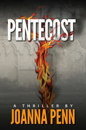
2. League Gothic (free from fontsquirrel.com): This sans serif font is very vertical, which is ideal for book titles. League Gothic would be a great choice for thrillers or business books, and it can be useful if you have a very long title, too. Here’s a sample on Joanna Penn’s terrific thriller.
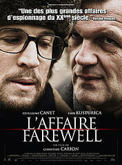
3. Trajan (available from Adobe): You might recognize Trajan, and that’s because it’s been used for more movie posters than any other font. It works quite well on books, too. This classic font is appropriate for histories, novels, and historical fiction, among others. Check out the French film poster using Trajan.
4. Franchise (free from fontsquirrel.com): Another tall and meaty sans serif, just ideal for the right book cover treatment. Franchise would be a great pick for a historical epic, for mysteries, or for thrillers. Here’s a sample of a novel in a gritty urban setting.
5. Baskerville (many versions available): Sometimes you need to have a straight roman typeface for your title, and in that case I like to use one of the variations of Baskerville, a highly readable typeface. You might find Baskerville perfect for a memoir, a business book, or a historical romance. Here’s a sample, and a cover from Vintage Books that shows how effective it can be.
Fonts That Work in Books
Okay, so now you know how to recognize oldstyle fonts, how is that going to help you? Let’s take a look at some of my favorite fonts for interior book design, and you’ll see.
- Garamond–There are many versions of typefaces known as Garamond, and this is one of the most popular families of fonts for use in books. A classic oldstyle font, Garamond is named for Claude Garamond, a publisher in 16thcentury France, and has given rise to many other similar typefaces like the also useful Sabon.
- Caslon–This font originated with William Cason, one of England’s first printers and has been popular ever since. Caslon is one of the most widely-used typefaces for text and works very well in books.
- Minion–A modern invention, Minion was designed by Robert Slimbach for Adobe Systems and has gone on to become one of the favorite fonts for book designers due to its regular color, interesting letterforms and the variety of weights and styles available.
- Janson Text–Another Adobe font, Janson is based on a typeface created in the Netherlands in the 17th century, and our recent version was created by famed type designer Hermann Zapf in the 1950s.
- Palatino–For a long time Palatino was the most popular oldstyle font of all, because it was included in the base set of fonts shipped with every new Macintosh, the original desktop publishing platform. Although it’s a beautiful font with some idiosyncrasies that designer Hermann Zapf included, I no longer use Palatino for books, exactly because it has been so over-exposed. But you might love it, so give it a try.
Top 10 Premium Fonts
This is the list of most popular premium (paid) fonts among designers. Some of them are very expensive but the quality of the font speaks for itself.
Common fonts for websites
Since not everyone is using the same operating system, it’s actually a little challenging to prepare a list of web safe fonts that you can use as pure text on your websites. Some people use Windows Vista or Mac OS X. Others use Linux. And others are still using older versions like Windows 98 or Mac OS 8! So to keep things safe, here is a list of the most common, standard fonts for websites that even people using ancient operating systems can see:
- Arial
- Courier New
- Georgia
- Helvetica
- Times New Roman
- Trebuchet MS
- Verdana
- Webdings
Here’s an image of what they look like:

I realize that this is a pretty short list, but remember that these fonts are to be used as pure text and not as logos or other fancy website design elements.
If you’re sure that most of your website visitors are using more recent operating systems, then you can also add these common website fonts to the list:
- Andale Mono
- Arial Black
- Century Gothic
- Comic Sans MS
- Impact
- Tahoma
- Zapf Dingbats
Here’s an image of what they look like:
 (There are a few more, but I’m the kind of website designer who prefers to use fonts that everyone can see.)

I realize that this is a pretty short list, but remember that these fonts are to be used as pure text and not as logos or other fancy website design elements.

What's the difference between TrueType, PostScript, and OpenType fonts?
TrueType fonts can be scaled to any size and are clear and readable in all sizes. They can be sent to any printer or other output device that is supported by Windows. OpenType fonts are related to TrueType fonts, but incorporate a greater extension of the basic character set, including small capitalization, old-style numerals, and more detailed shapes, such asglyphs and ligatures. OpenType fonts are also clear and readable in all sizes and can be sent to any printer or other output device that is supported by Windows.
PostScript fonts are smooth, detailed, and of high quality. They are often used for printing, especially professional-quality printing, such as books or magazines.
Which font will work best for me?
It depends. If you just want a font that prints well and is easy to read on the screen, then consider using a TrueType font. If you need a large character set for language coverage and fine typography, then you might want to use an OpenType font. If you need to print professional quality print publications, such as glossy magazines, or you need to do commercial printing, PostScript is a good choice.
It depends. If you just want a font that prints well and is easy to read on the screen, then consider using a TrueType font. If you need a large character set for language coverage and fine typography, then you might want to use an OpenType font. If you need to print professional quality print publications, such as glossy magazines, or you need to do commercial printing, PostScript is a good choice.


No comments:
Post a Comment